Power in a Postcard - The Story Behind the Story of How Black Fives Came to Life
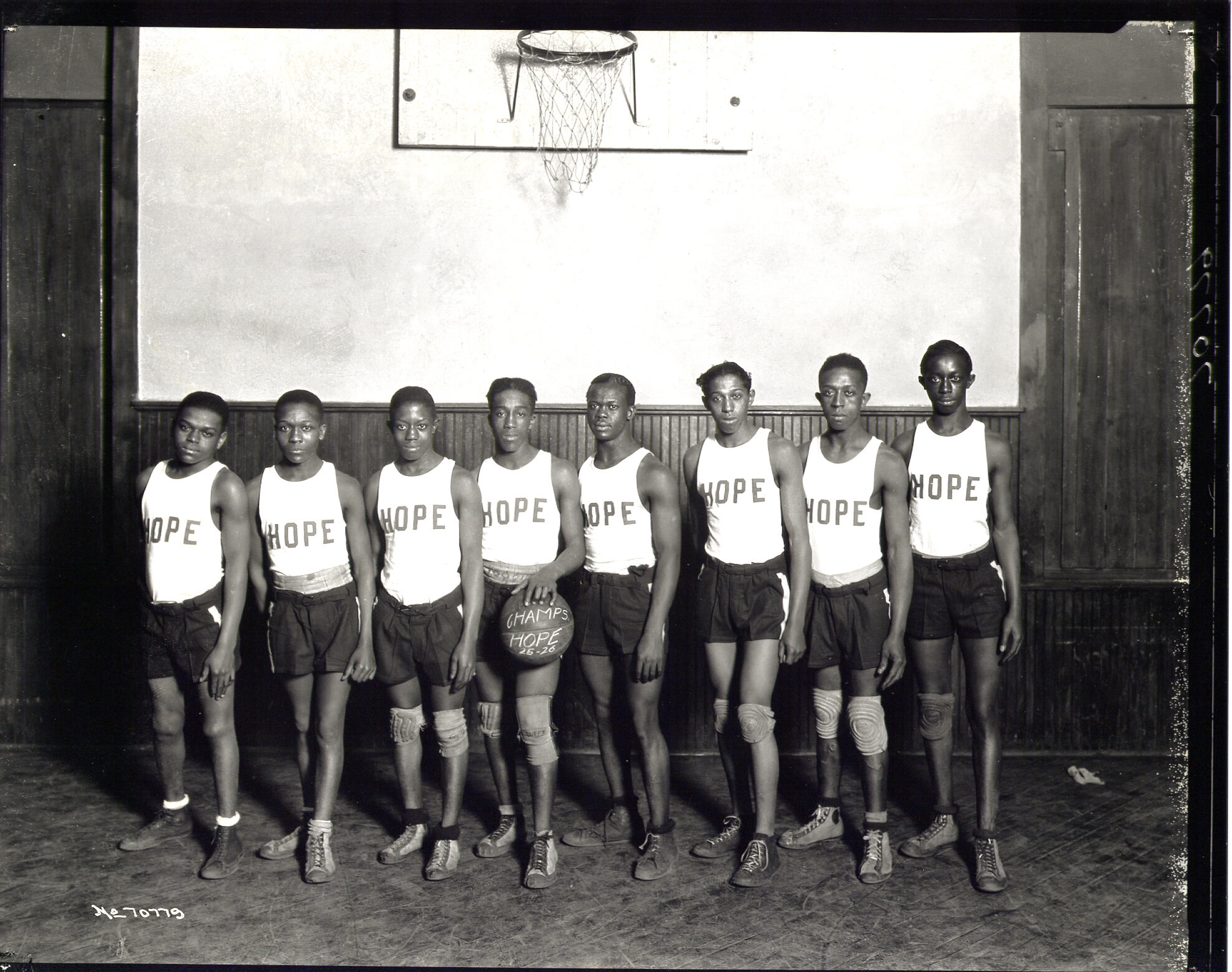
When I first moved to New York City I often went downtown to explore the shops and street culture. It was 1994 and one could still get a glimpse of the Bohemian, artistic community SoHo once was. One-off boutiques were the standard then, in contrast to today’s more generic, mall-like backdrop. One day I stopped in a postcard shop and saw a black-and-white photograph of eight young Black men, lined up side by side beneath a basketball rim. They were wearing shorts, canvas sneakers, knee pads and white tank tops with the word HOPE in block letters on the chest. The player in the middle held a ball with the words ‘Champs 25−26’. I was immediately captivated by both the uniqueness and the beauty of the photo. It was clearly from another time; far from the era of basketball I knew. Who were these players? Why had I never heard of them? Who thought enough of them to create the postcard? What did HOPE signify? The meaning I assigned to it was hope for a better future. I was moved. Soon after, I found a Richard Avedon photo of a young Lew Alcindor. It was equally as captivating as the HOPE photo, but I knew this player. In the photo he was a high school player; an earlier version of the phenomenon he would become as Kareem Abdul-Jabbar; confident, standing tall, muscular and lean, slightly in motion, palming a basketball and looking down directly into the lens. The photo is as powerful as it is beautiful. These photos were incredibly inspiring. An idea began to take shape.
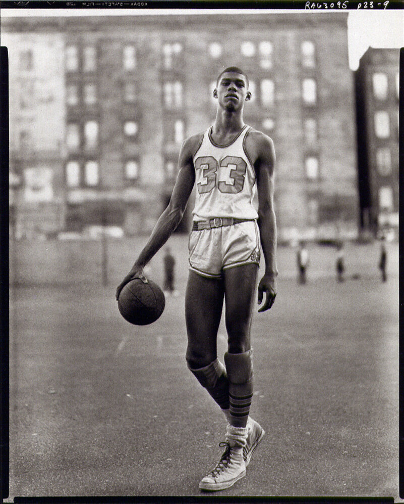
Photo - Lew Alcindor by Richard Avedon

A Time of Discovery
Different discoveries that happen at the same time, and also complement each other, can be magic. In 1994, the time that I discovered the photographs, my brother Claude Johnson was working at the National Basketball Association in international licensing. That year they published an 850-page encyclopedia which chronicled the development of the sport and some of the earliest known teams and players. It included teams that existed before the founding of the NBA, such as the Boston Celtics, and two Black teams: the Harlem Globetrotters and the New York Renaissance Five. At about the same time he had discovered Arthur Ashe’s book, A Hard Road to Glory, which chronicled the history of African American athletes from 1919−1945. In it Ashe referenced basketball teams that were not in the NBA Encyclopedia. That inspired a research movement that is ongoing today. But already then a remarkable narrative was emerging; a story that needed to be told.

History Segregated
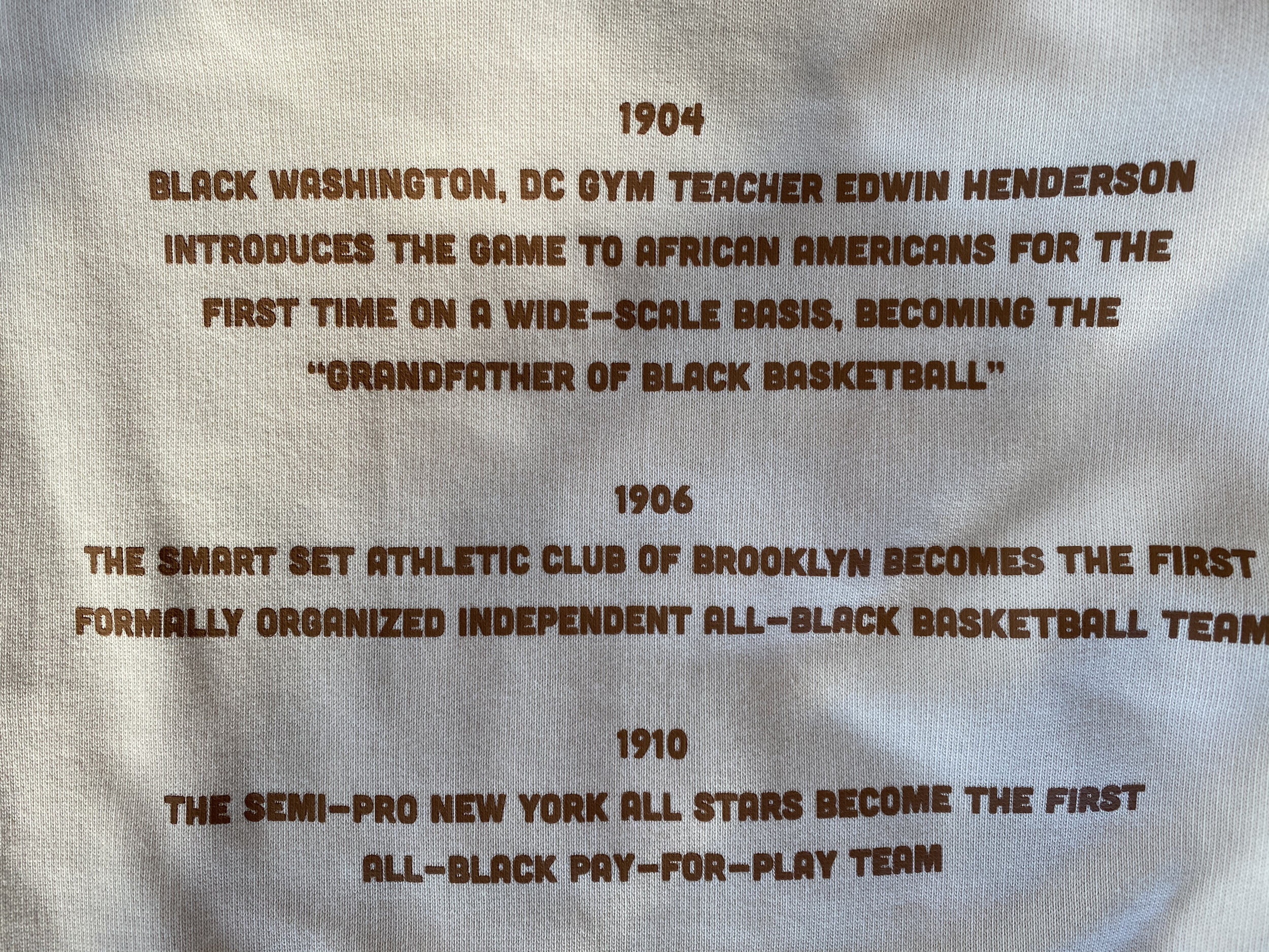
The majority of Pre-NBA basketball history as described in the 2nd Edition of the NBA Encyclopedia focuses on white teams and players. Although there were many black teams prior to the founding of the NBA, only two were mentioned in the 842 page book. The Black Fives research movement uncovered no less than 20 black teams from New York, New Jersey, Washington, DC, Pennsylvania, Ohio, Illinois and California.
Fives Come Alive
The more history that surfaced, the more I fell under the spell of this incredibly rich and romantic sport history movement. As someone who values heritage and the legacy that a brand can represent, I imagined a new one emerging; one that was authentic and would resonate to a community hungry for the history of its people. Further, it would bring new energy and awareness to the sport. As a designer it represented a once in a lifetime opportunity and challenge. In order to establish a solid foundation for the brand more research had to be done. In a relative short period of time we found that even more black teams existed than were documented in the NBA Encyclopedia. I also began to learn about iconic teams and players whose skills and style contributed to the advancement of the game. In large part these stories were suppressed but they were recorded journalistically outside of mainstream media. In reports, African American teams were often referred to as “black fives”. Also revealed were the iconic players from that era; some we discovered lived in New York City. When we found that John Isaacs who was famous for his career as a World Champion New York Renaissance Five member was living in uptown Manhattan we paid a visit to him. An upfront and close connection to the people that shaped the history was magical and incredibly inspiring. One thing that stood out to me when speaking with John Isaacs was his account of the way he and his teammates played the game. While they were creative in their style of play and pushed the game forward in terms of skill and athleticism he emphasised teamwork and the value of executing a good pass over taking a shot. That matched with my own personal values around working with people. I prefer enabling others to do their best over being at center stage.

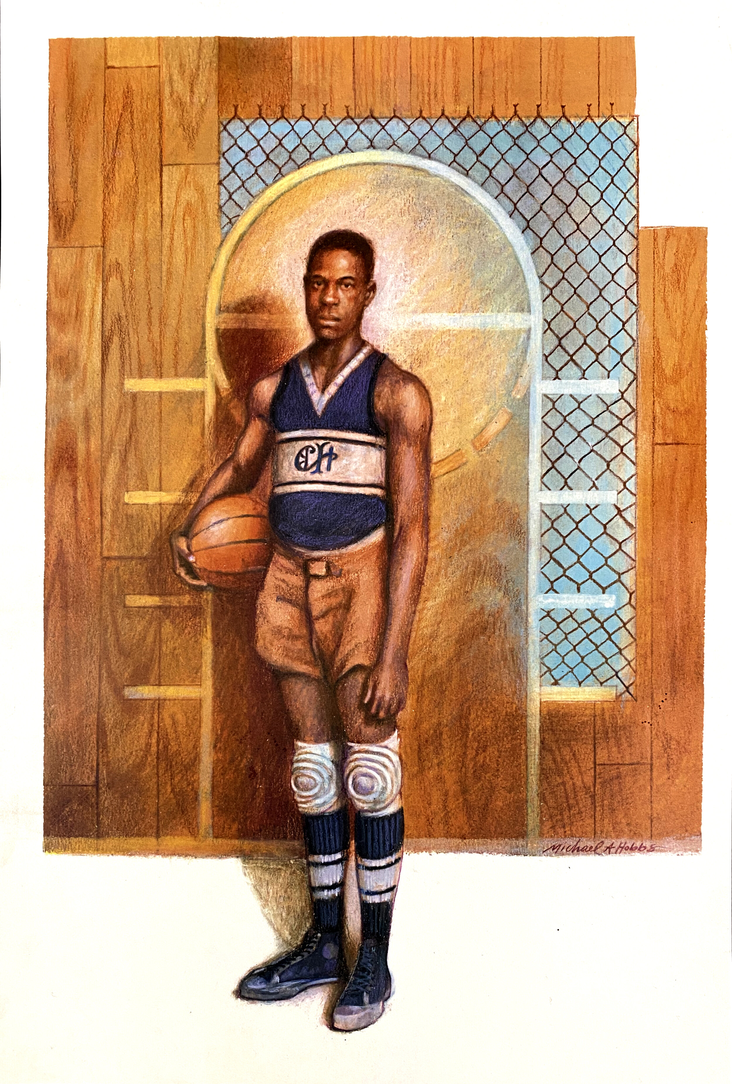
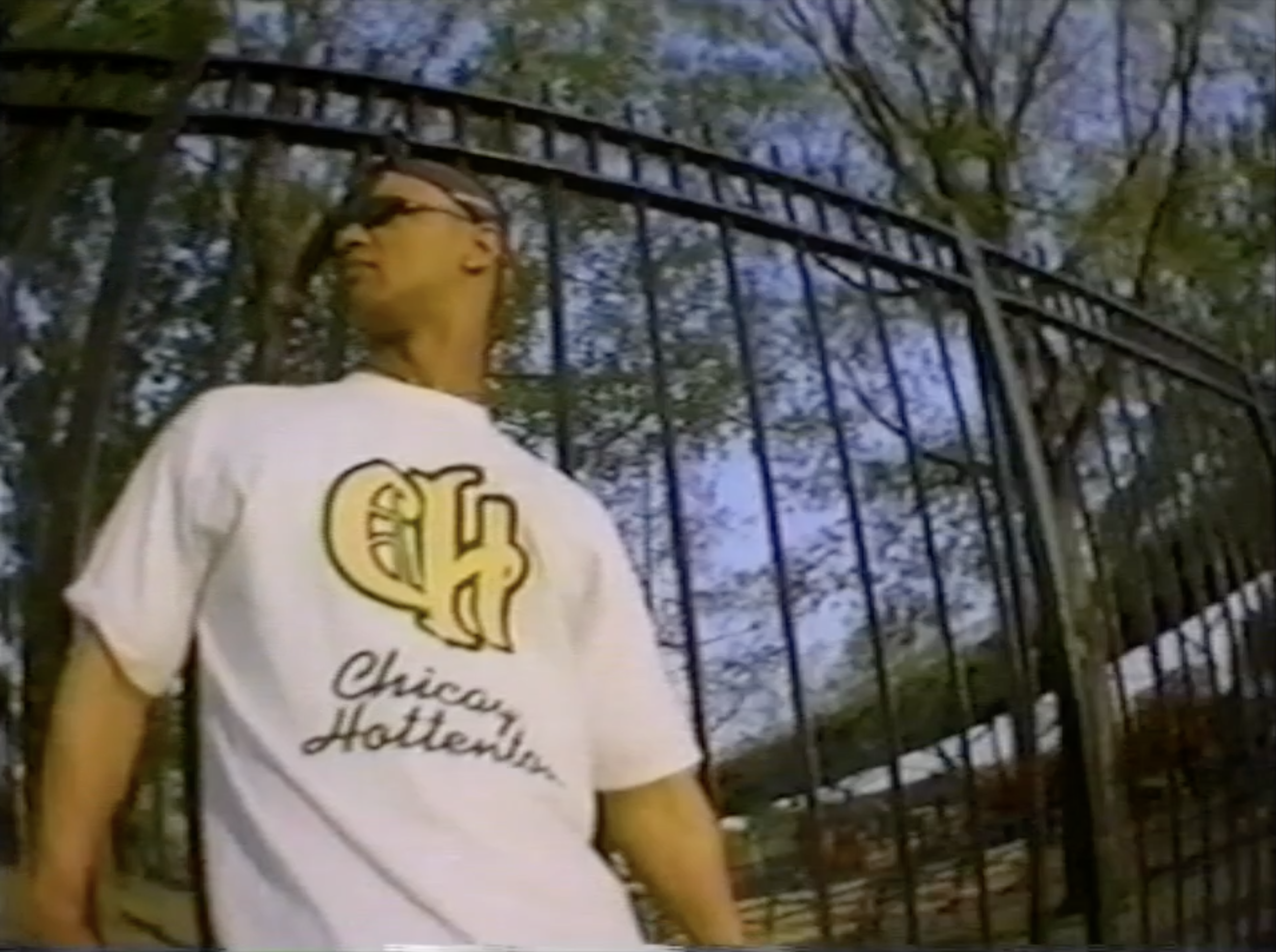
Over time the Black Fives effort uncovered more and more photographs of teams and players. In the early days however few existed; yet there was a need to communicate the era visually. I commissioned this illustration depicting a Black Fives era Chicago Hottentots player.
Illustration by Michael Hobbs
A New Business Model
Establishing a brand was one thing. Turning it into a business was quite another. As a small business I did not have the development, manufacturing, sales and marketing infrastructure required to launch a brand. But I had strong creative.
Through Sports Creative I was designing for more and more brands. In some instances my client was not the brand itself but rather a business that had the licensing right to develop and manufacture product using the brand identity. This struck me as a worthwhile model for shaping my new business venture.
Still there was more to learn when it came to licensing. I called on university friend and attorney, Jerry Stahlecker to guide me through establishing a licensing property. Jerry was gracious enough to offer his time pro bono. Without that support I might have never succeeded.
So that was it. I was to enter the licensing business. Sports Creative would design for the brand and I would license the rights to others to develop and manufacture product. A great idea. But I needed a name.
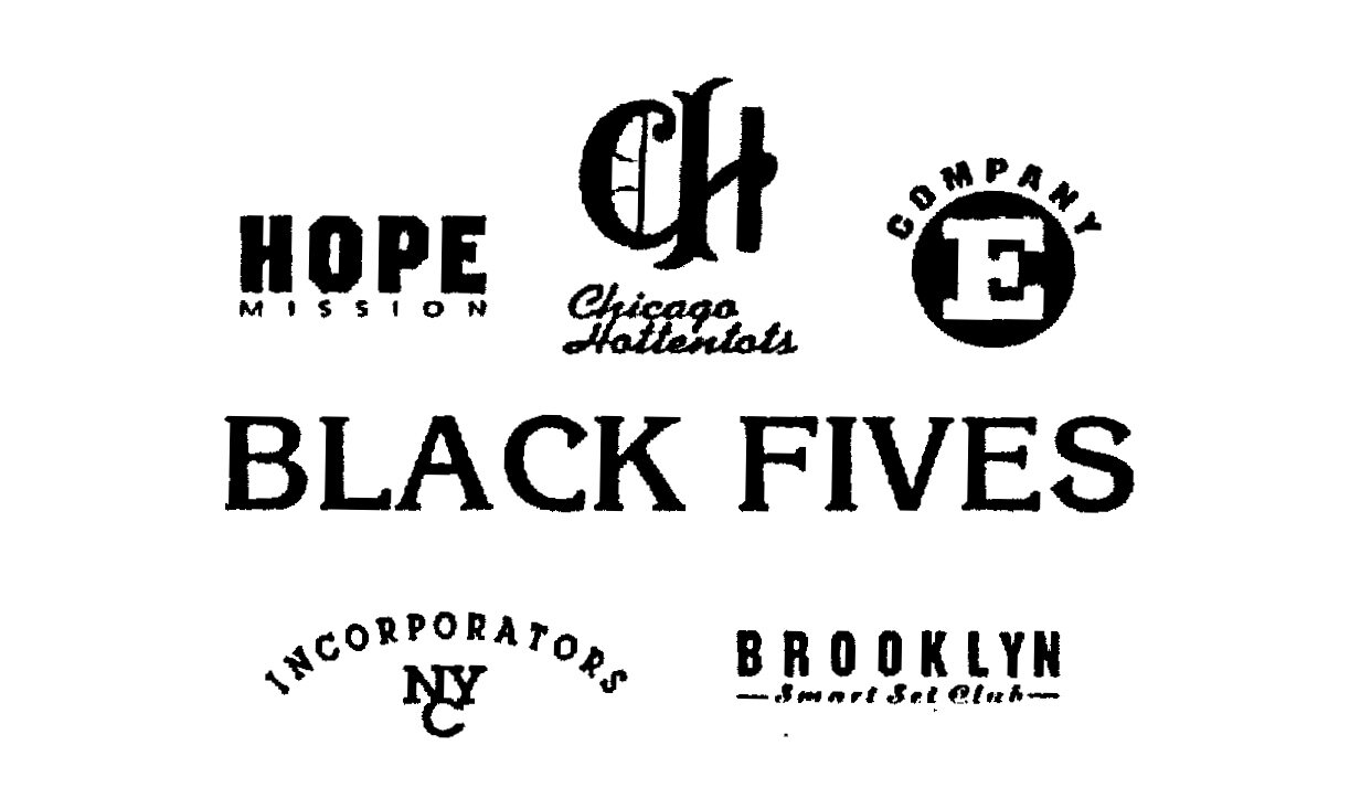
The purity of the term “black fives” was compelling; it was potent in its simplicity which made it the ideal candidate for a brand name. I decided to trademark it. Research exposed a number of teams for which there was no visual identity or ownership rights. I also wanted to use those names. Hope Mission, Chicago Hottentots, Brooklyn Smart Set, Company E and NYC Incorporators were included in the initial trademark application. On September 25, 1995 an application for the trademark of Black Fives and five original teams was filed by Sports Creative Group, Incorporated.
Image - Black Fives and the first five team names submitted for trademark application are bitmapped from fax transmission. The original artwork no longer exists.

The Art in the Logo
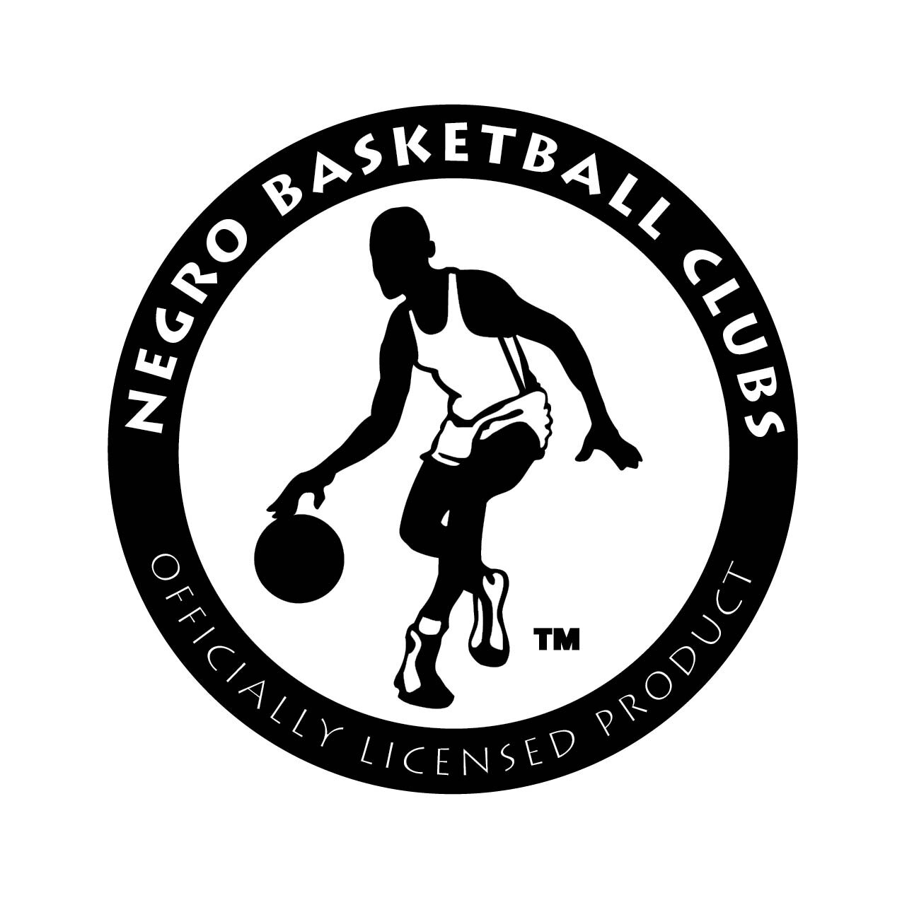
It was important that the design of the Black Fives logo was bold, iconic, clean and ready to be applied to a range of products. I sketched a logo that drew direct reference from both the Hope Mission and Lew Alcindor photographs. I was somehow pleased with the result but also intuited that I might get better results from a professional. I commissioned Brooklyn illustrator Chip Wass who was known for his iconic and contemporary style he brought to Nick at Nite and The Cartoon Network among other things. Chip nailed it. He managed not only to portray five black basketball players in a beautifully simple way but also the distinct character that I wanted to portray; poised, proud and ready to play. Their body language is both weary and strong; their uniform complete with knee pads true to the Black Fives era. There was no formal league in that time, but I understood that league endorsement communicates a certain authenticity; in the same way the National Basketball League logo does. It would also be useful in defining on-court and off-court product. A second logo was designed to represent the Negro Basketball Clubs; the fictitious league of the Black Fives teams. In this logo a black player is depicted in almost a dance-like pose dribbling a ball paying hommage to the pioneering style of play characteristic of black players of the era.
No League Of Their Own
Unlike baseball whose segregationist practices spawned the Negro Leagues, the Black Fives era had no such organising body. From a marketing point of view we thought it made sense to have a second logo to which Black Fives teams could be associated. In the end this proved to be less valuable and lacked the authenticity inherent in the Black Fives story.

Creative Direction
Before shaping product it was essential to establish the look and feel that would guide all design activity that was done for the brand. The creative direction I shaped illustrated both practical and emotional aspects that would become the visual narrative of the brand. Authenticity over flash. Heritage over futurism. Rich and focused details. These were the mantras we referenced as we breathed life into products and graphics. Creative direction was expressed through a series of storytelling boards.
Image - Creative Direction: Details

The Cage Effect
I wanted to make sure the brand would be relevant to basketball consumers of the day. The game that was played at courts such as the 4th Street Cage in New York’s West Village and Rucker Park in Harlem embodied the basketball zeitgeist of the times. Black Fives Creative Direction set out to mirror that physical, visual attitude and emotion.
Image - Creative Direction: Emotion
Built For Ballers
Products in the collection were designed for both on and off court. Authentic Goods were team uniform based, Performance Goods were basic basketball silhouettes for practice and Casual Goods were designed as street wear. The shoes were simple, iconic and built for hardcore play.


Telling the Story
Once the narrative was shaped, product was developed and the sales plan confirmed, we set out to tell the story. We did so in the traditional manner; preparing a press kit which included a press release, product information, historical information, retail locations, background on myself and Sports Creative. It also included a video copy of an NBA 24/7 television interview. Scroll down to view it.
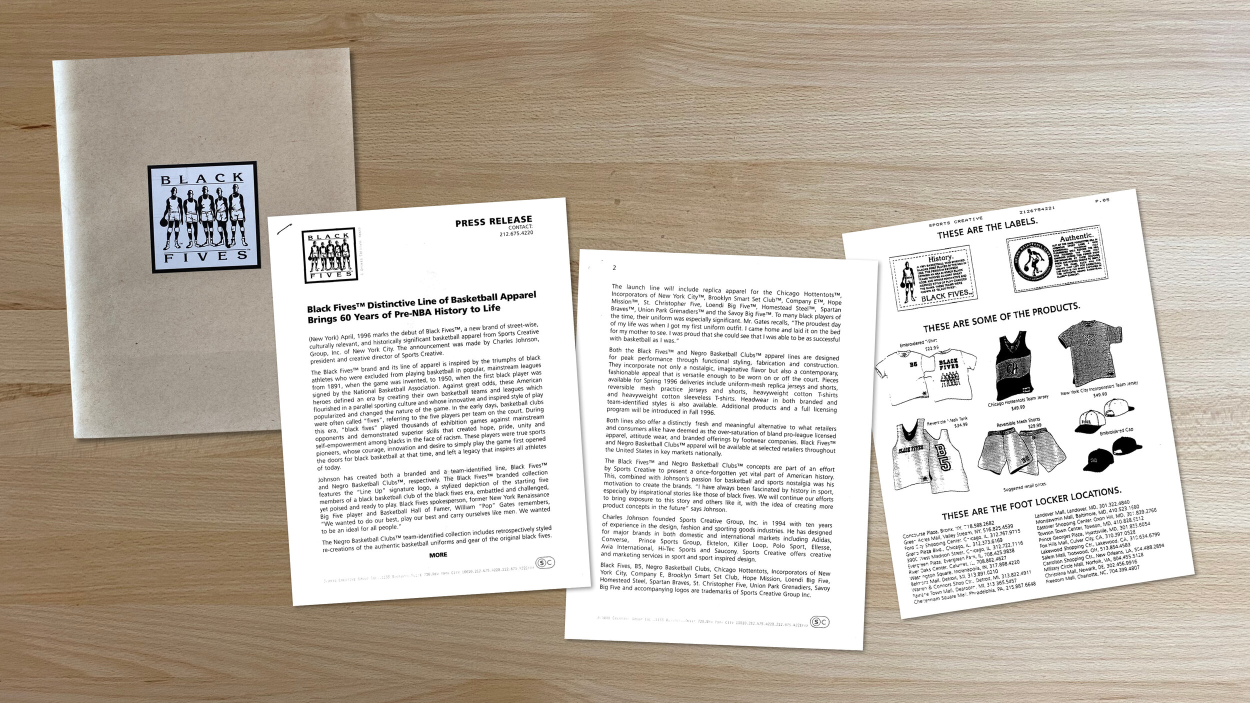


The Launch Collection
With Black Fives established as a property Sports Creative was now in the position to license it. My first licensee was Footlocker. I designed a small collection of apparel which they agreed to produce and test in their Bronx and Valley Stream, New York locations. I placed an ad in Slam Magazine, the go to magazine for all things basketball at the time. It was a thrill to not only see my products realised but also for sale in stores. There was incredible satisfaction knowing that the work I put into it was for me and not for another business. Although the business did not take off, it marked the beginning of something that would continue successfully.
In 2000 I decided to close the doors of Sports Creative in exchange for a position in the basketball division of Adidas in Portland, Oregon. I assigned property ownership to Black Fives, Inc., the company my brother set up to continue the Black Fives effort. Later the Black Fives Foundation was established as a non-profit which showcases the history of the Black Fives era of basketball, to engage youth, while honoring its pioneers and their descendants.
Photo - The first Black Fives products retailed at Footlocker in Queens, NY.

Air Time
British television journalist Mark Webster picked up on the Black Fives story and interviewed me for his basketball lifestyle show NBA 24/7 on British Channel 4. We shot on location in Harlem at Rucker Park and outside the Renaissance Ballroom with New York Rens legend and NBA Hall of Famer, John Isaacs.


“I remember the first time I met Charles. I vividly remember him waiting out in reception on the couch and when we met, we immediately hit it off. I had instant love for The Black Fives and for Charles and then later his brother Claude. They were so passionate about preserving the history of African Americans in basketball. Beyond the obvious which was that this was an incredible opportunity to educate young and old basketball fans as to what the Black Fives was, how they came about and how meaningful and inspirational the history of African Americans in basketball was prior to the NBA’s existence. These guys had actually created a dope clothing line and brand to pique the interest of those that didn’t even know this history. From a creative standpoint I loved the simplicity of the original logo with the five ball players with their silhouette. Black on white and really clean. As the brand continued to grow and develop, I admired the vigor in which the Johnsons continued to work on not only a great creative concept but even more so the educational piece of it all.”
— Ronnie Zeidel, Associate Publisher, Slam Magazine
The Foundation Turned Foundation
Claude unearthed so much rich history over the years there was cause to make much more of the Black Fives story. He founded the Black Fives Foundation, a 501(c)3 whose mission it is to research, preserve, showcase, teach, and honor the pre-NBA history of African Americans in basketball. Here Claude is shown at the unveiling of the Barclay’s Center permanent exhibit of Black Fives portraits celebrating the legacy of African-American basketball in Brooklyn.

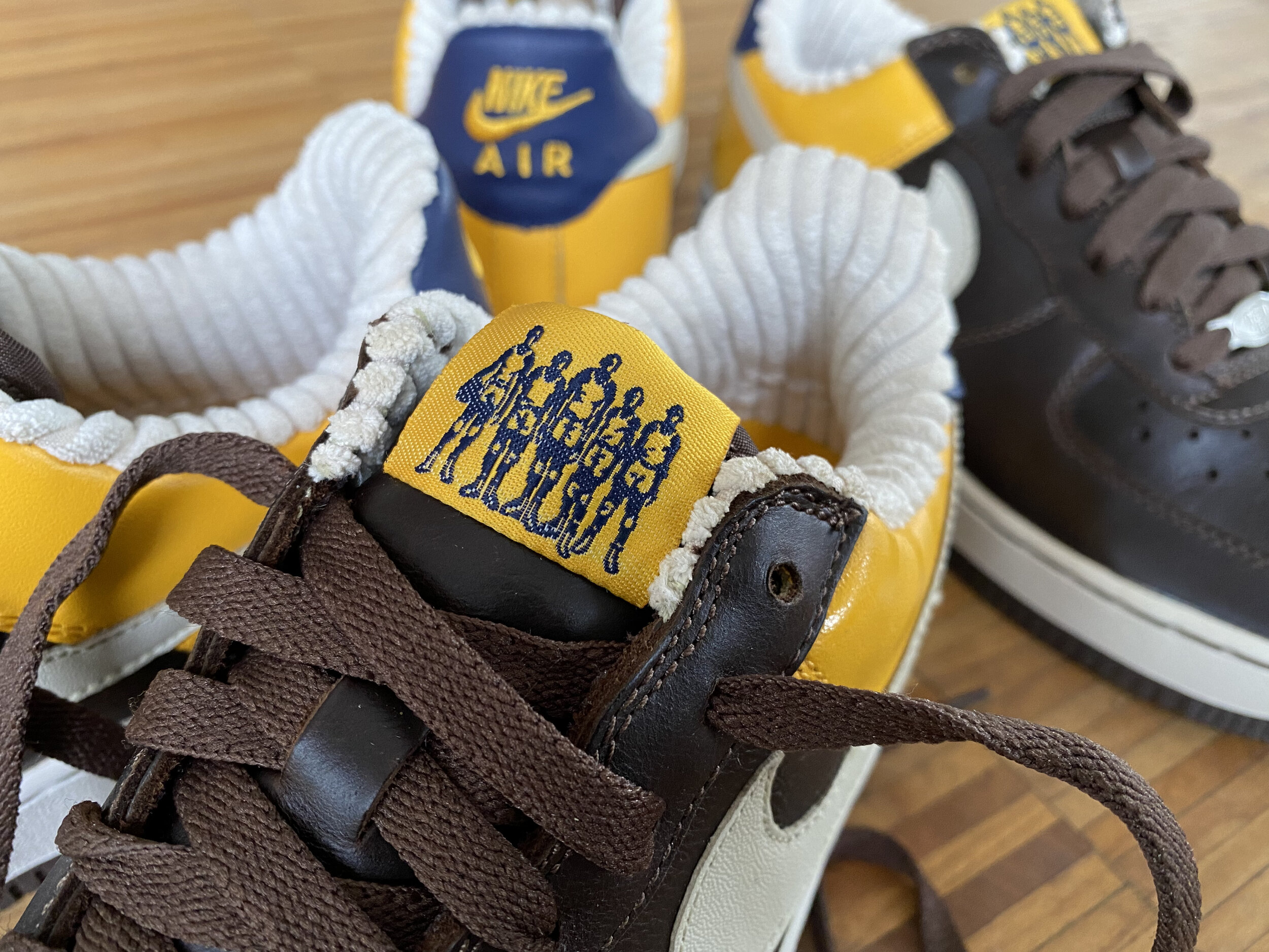
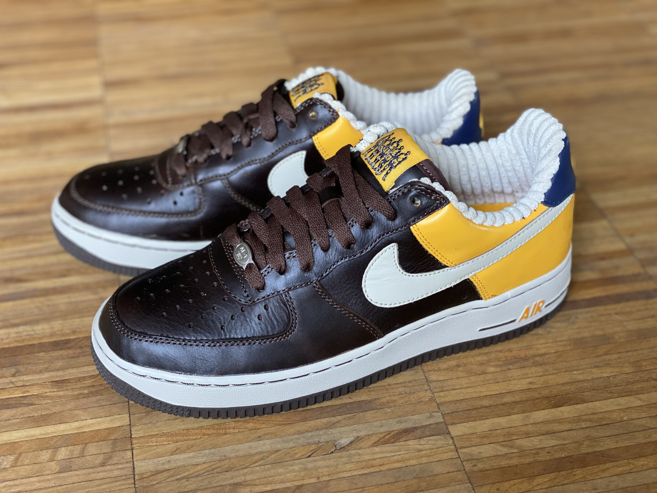
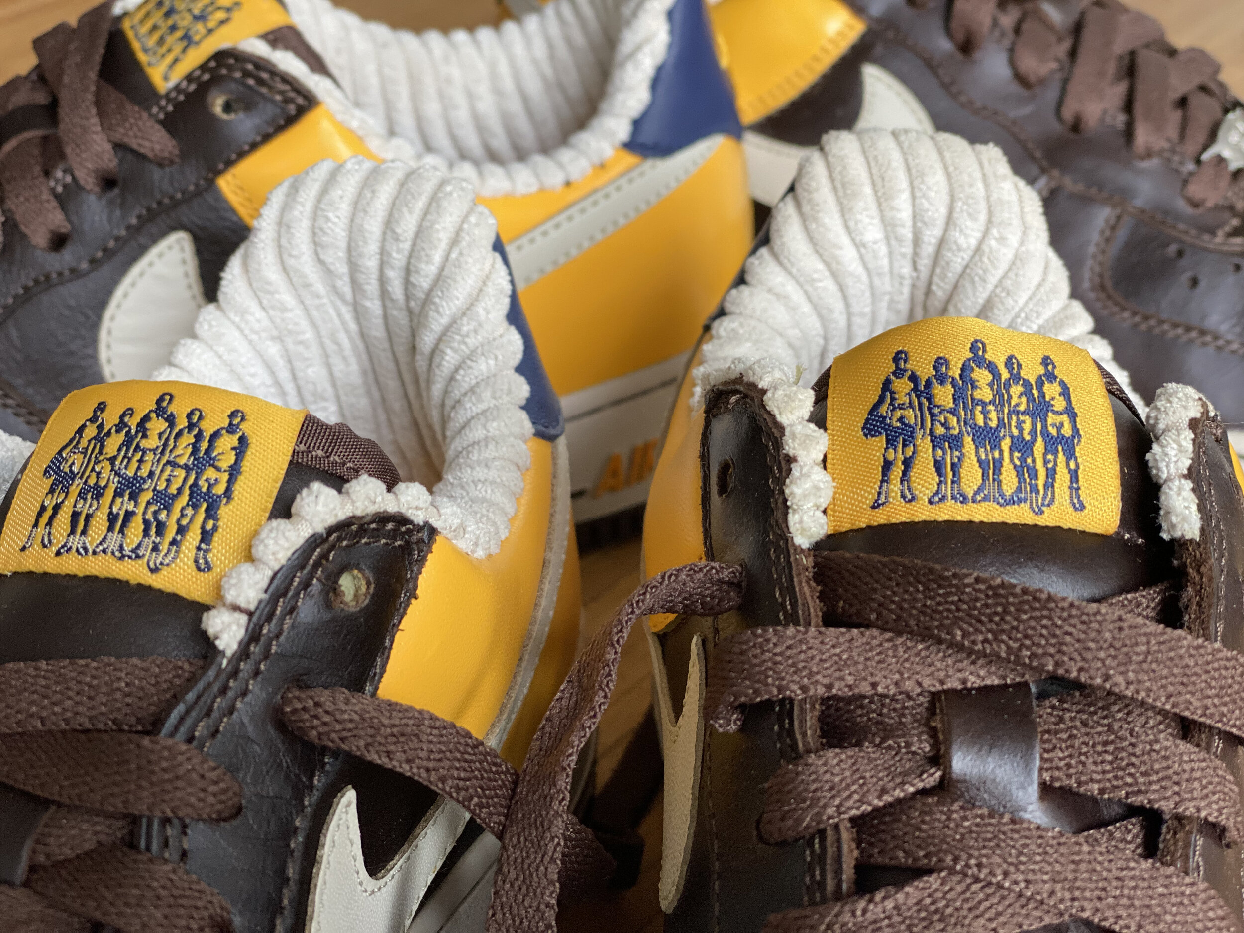
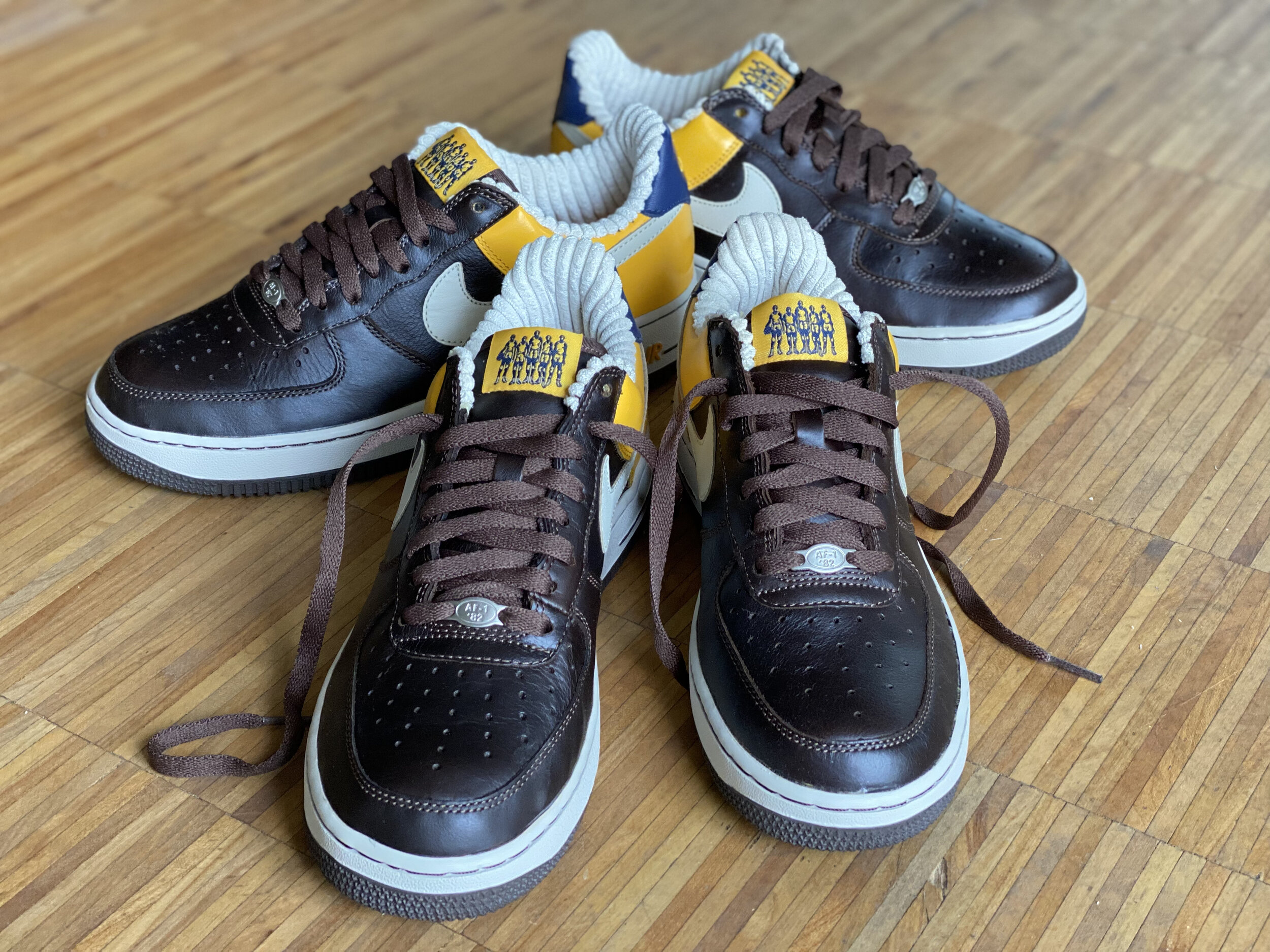
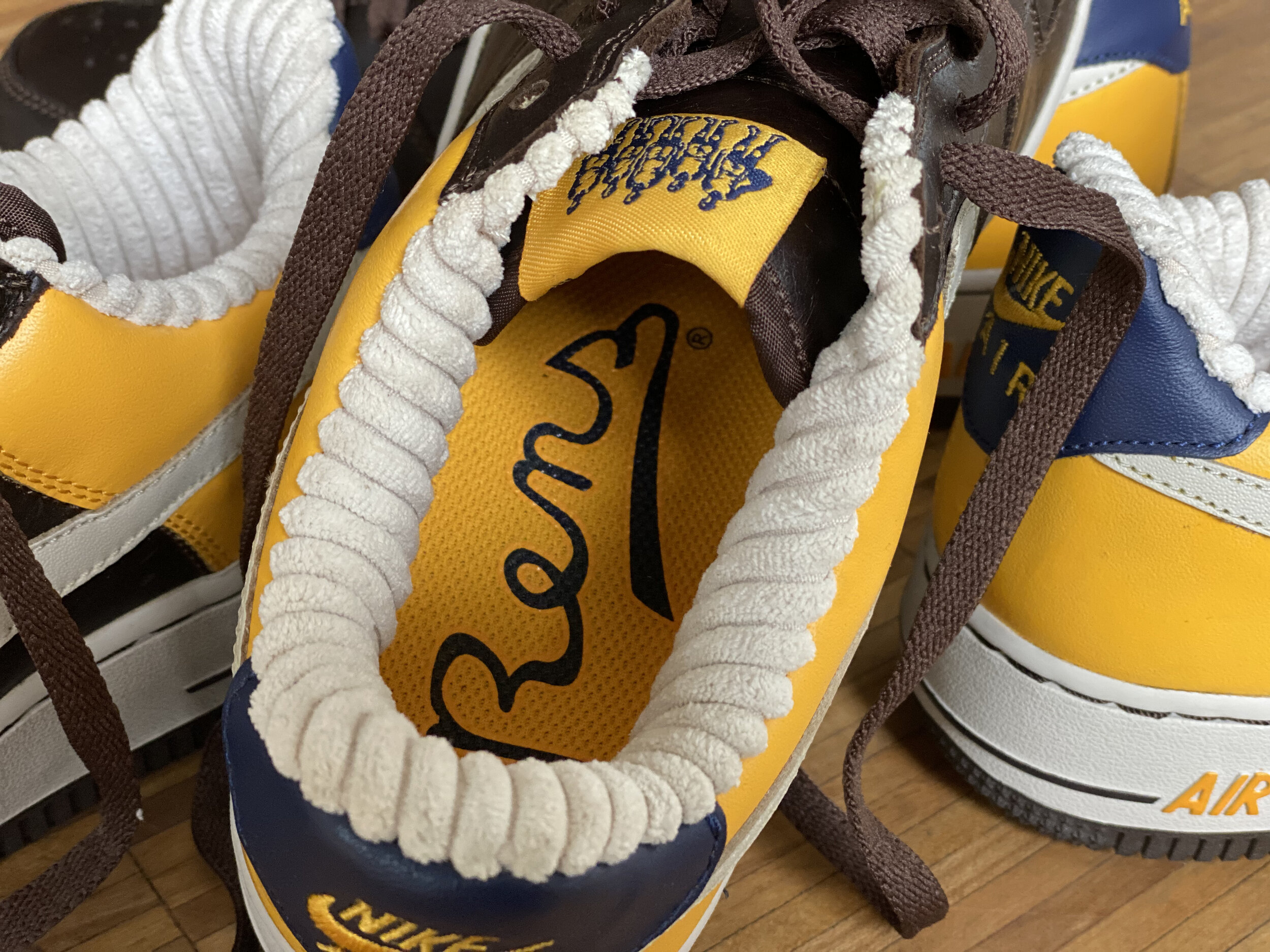
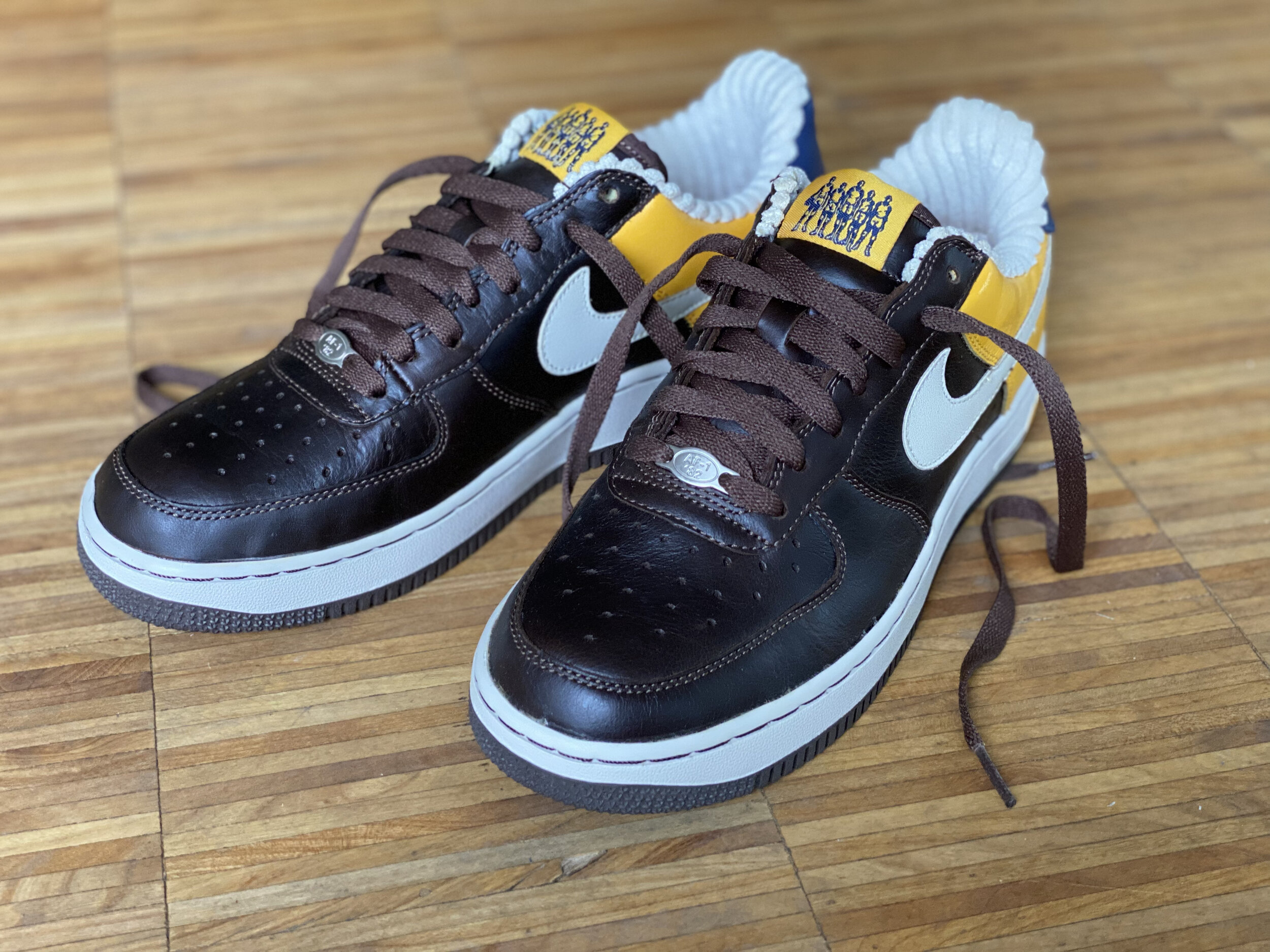
Black Fives x Nike Premium
The Black Fives Foundation secured licensees from a carefully curated group of partners. Among them was Nike who created a collection of Black Fives Air Force Ones for their Premium range. Black Fives teams were featured including the New York Rens.
Collaboration Continued
Through his tireless research into the Black Fives era Claude amassed a wealth of history a portion of which he captured in his book “Black Fives”. I had always wanted to design a book cover. This would be my first.

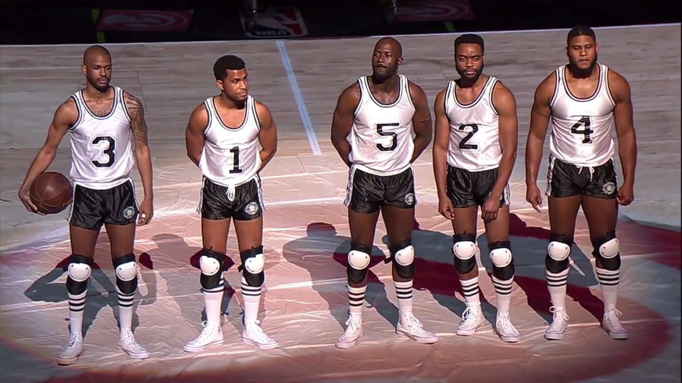
Forever Inspiring
Players from the Black Fives era helped shape the game as we know it today. Their hope, creativity and pioneer legacy have persevered. The Black Fives Foundation partnered with the Atlanta Hawks to celebrate the era through this unique halftime presentation. I really appreciate the modern take on the Black Fives era look and function that the players here showcase.

Black Fives Day
“Now therefore, I, Michael Bloomberg, Mayor of the City of New York, in recognition of the Black Fives era, and in appreciation of Claude Johnson and the Brooklyn Nets commitment to preserving an invaluable piece of our city’s history, do hereby proclaim Sunday, February 10th, 2013 in the City of New York as Black Fives Day.”
“Black” Mattered
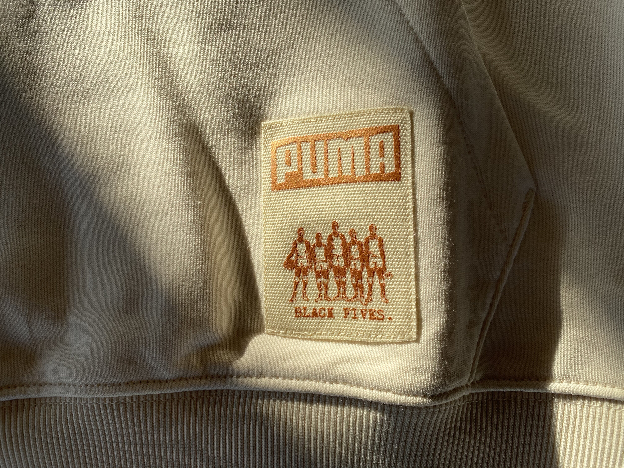
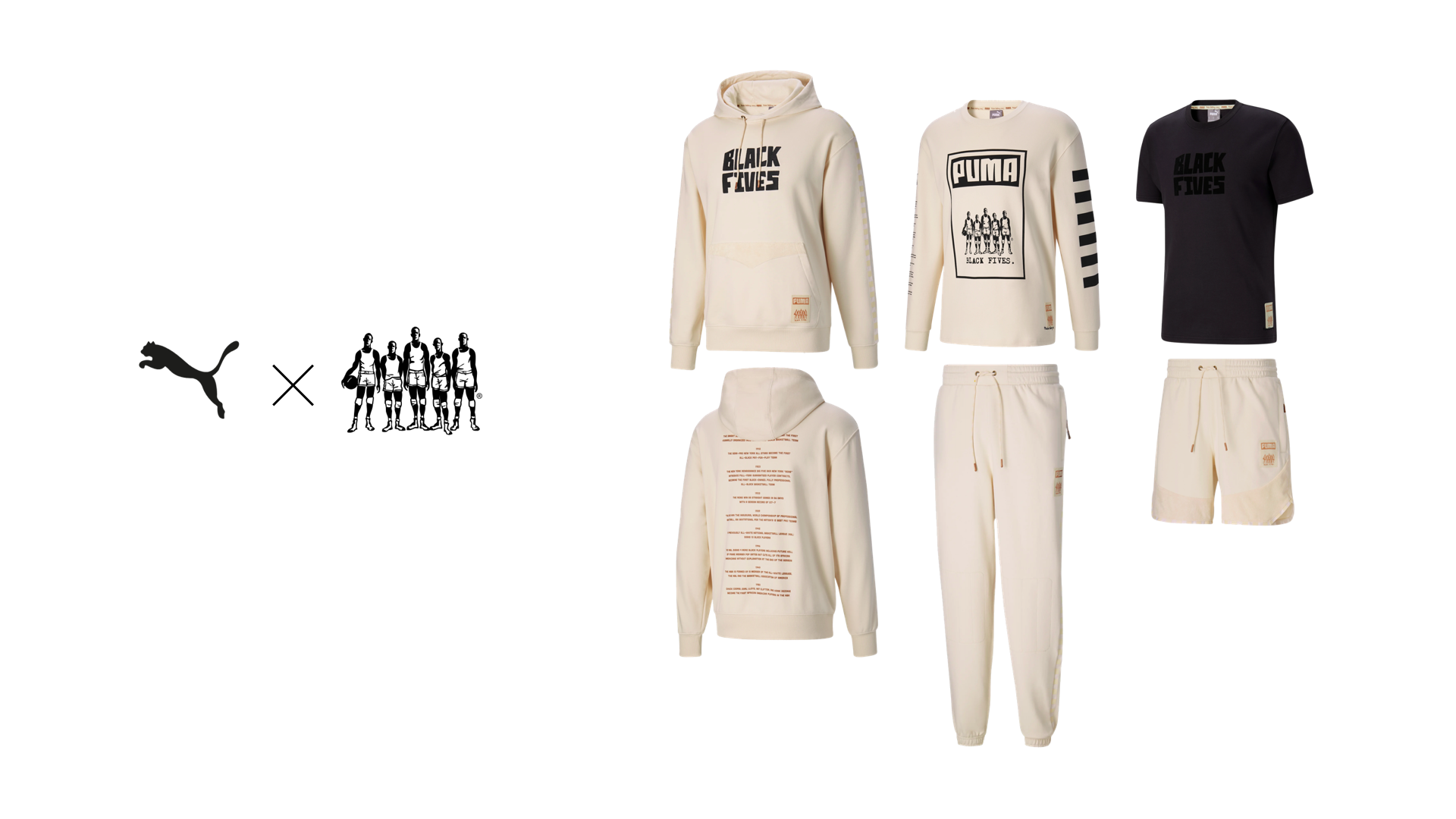
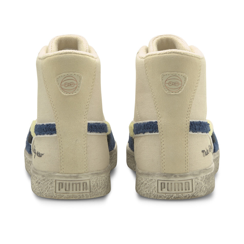
I designed the first Black Fives apparel in 1995. It was a modest collection consisting mostly of graphic t-shirts but also caps and performance tank tops and shorts. Since then, collaborations with Mitchell and Ness, Nike, 47 Brand and Converse ensued. Twenty six years later Puma launched a collection in part to commemorate Black History month. The product mix is deeper and includes both apparel and footwear. The collection also marks the beginning of a multi-year partnership between Puma and the Black Fives Foundation. I am proud to have originated a brand that has grown to become a means to amplify awareness of an important part of Black history in America.
While the Black Fives brand celebrates the past, its inception was futuristic. In 1995 the term “black” was considered somewhat controversial. At that time African American was widely accepted as the appropriate term for Blacks in America. But it was important to me to shape a narrative that remained true to the historical discovery we had made. That meant using the term Black. Today Black is no longer controversial but rather a term that resonates with people across the globe.


Creative Direction - A Test Of Time
Despite the fact that I was at Puma when talks began of a Puma x Black Fives partnership, I had nothing to do with the design of the collection. I had seen some drawings but had no real sense of how the product would execute. And so when a package showed up in the mail with Black Fives product I was anxious to give it my critique and to see if it lived up to the standards that I set for the brand 25 years ago. The brand I created was meant to bridge the past with the present; to convert a rich history into a modern form. The visual representation of the brand was to be simple, authentic and iconic. It paid attention to details; it used traditional elements applied to modern product silhouettes using contemporary production methods. It would be the mix of things that would make it special; that alongside the overarching message of an unrecognised yet important contribution that one community in America brought to the world.
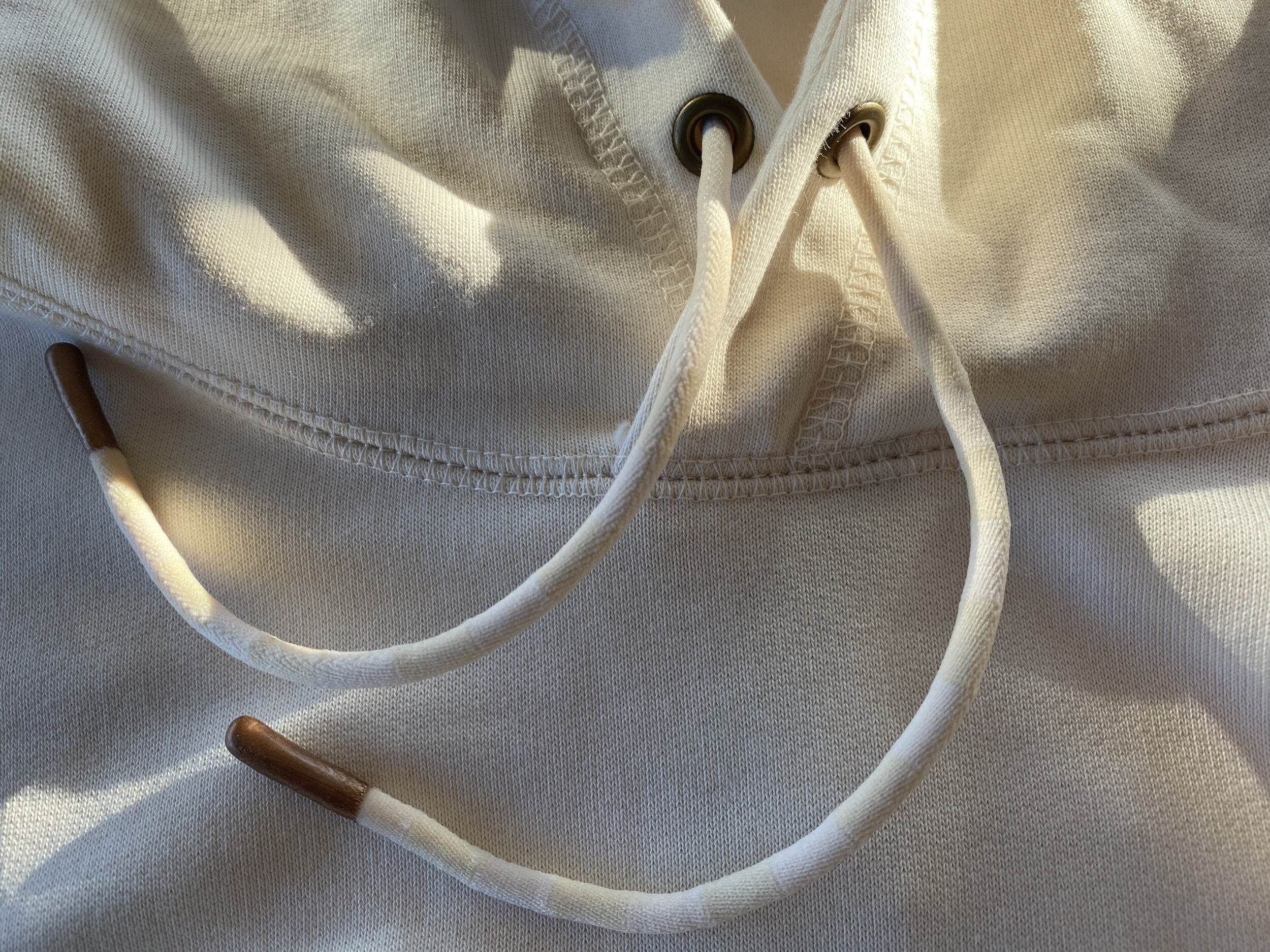
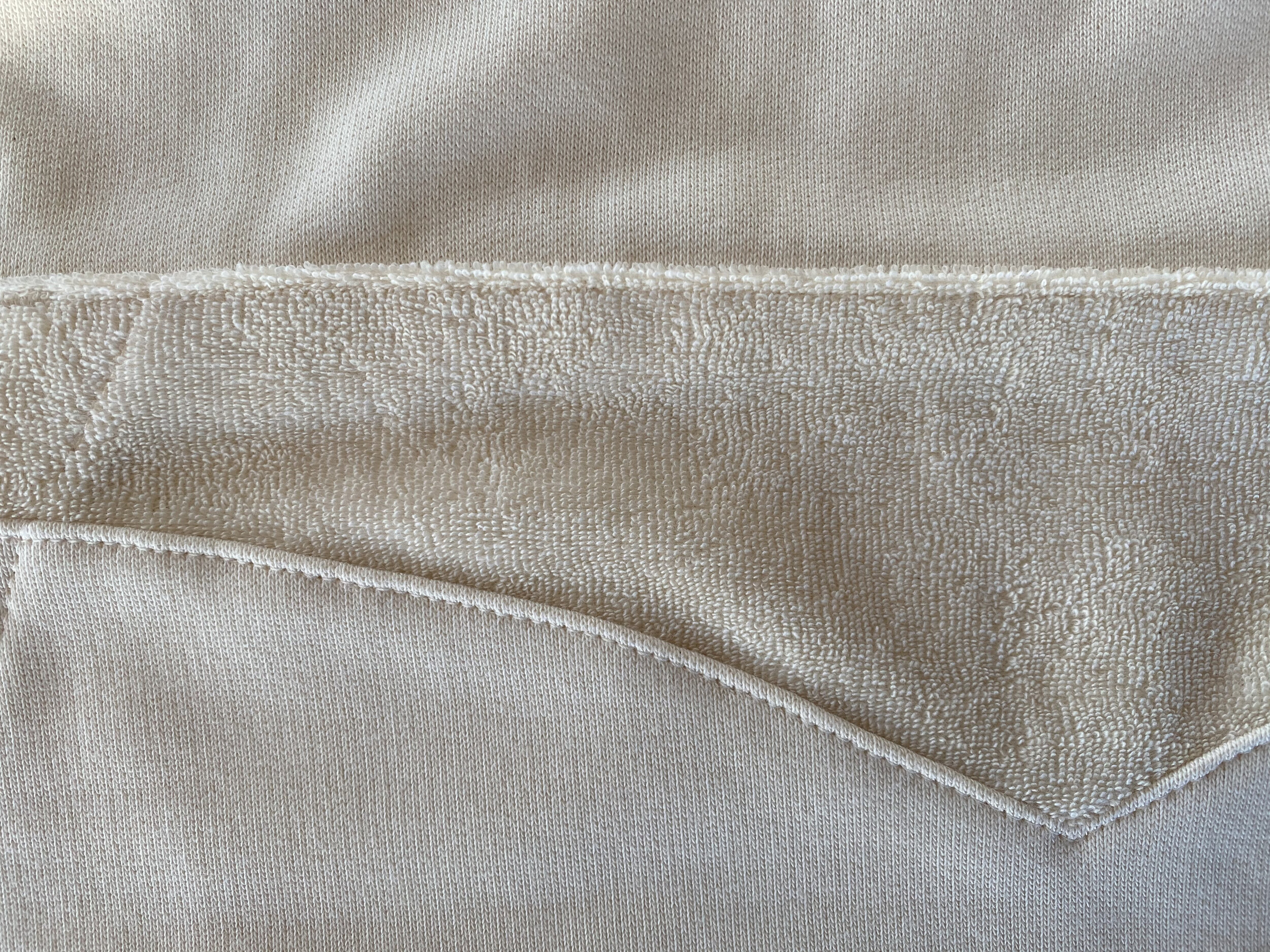
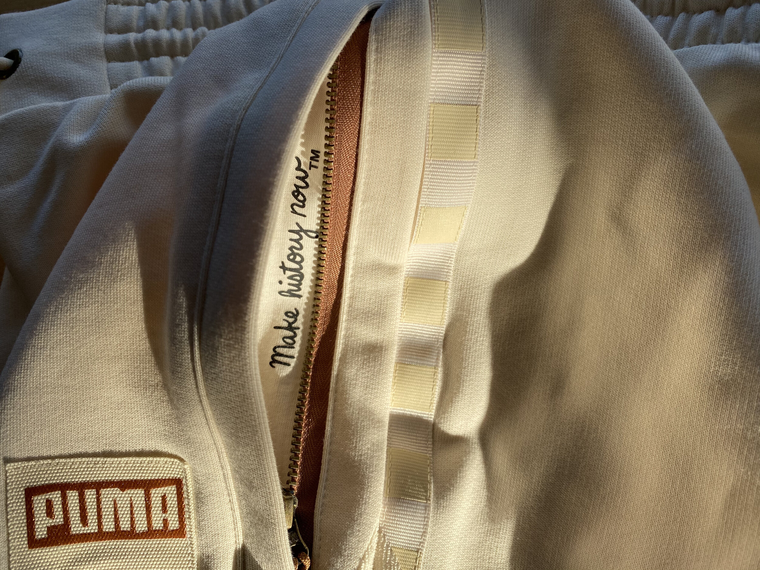
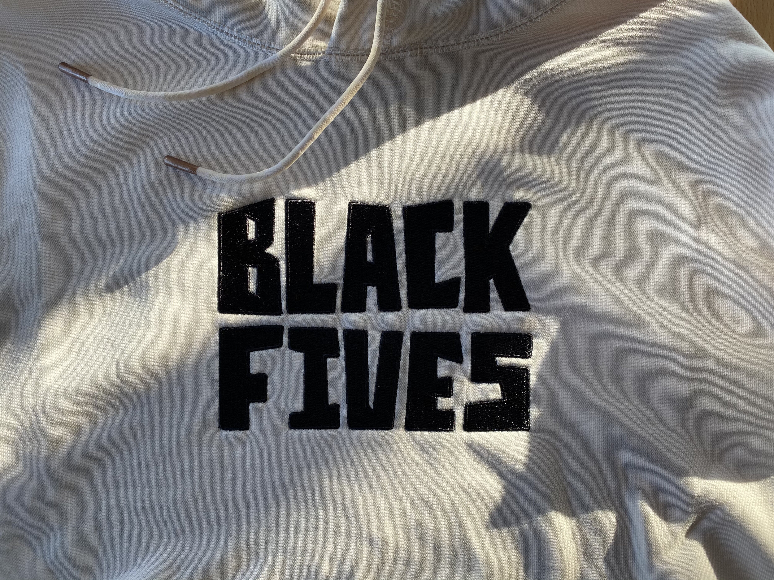
The first read of the Puma collection is good. I like the coloration; off-white used as a base color throughout the collection really says vintage. The messaging elements (words and logos) are clear. The Black Fives written in block letters competes with the Black Fives corporate logo but I like it for its boldness. The silhouettes are uncomplicated and fit the basic needs of the game. A closer look exposes details that are functional and communicate quality and uniqueness. I included traditional chenille patches on the original creative direction boards. Puma used this same detail on the shoe but in a multi-coloured execution; this is a very nice detail. And an even closer look inside the garments reinforces the Black Fives Foundation call to arms, Make History Now. There is a certain sophistication that the garments embody which uphold the character of some of the Black Fives teams such as the Smart Set Club or Alpha Physical Culture Club; that is fitting as basketball games were very often held in ballrooms and were followed by a dance. The surface mix of the fabrics is very nice as well; a variety of denure in the same tone adds richness. Lastly the hardware used for zipper pulls, string tips and cord grommets are functional, bring quality and add to the heritage based aesthetic.
Overall I think the product is fitting to what was originally intended for the Black Fives brand.

Black Fives Design Philosophy
Established 1996
Integrate contemporary styling with nostalgic appeal.
Communicate valuable, inspirational history through the product.
Maintain creative conscience in everything involving the brand.