


Design With No Guidance
When I arrived at Puma I was struck by two things. On the one hand that brand had a strong legacy grounded in sports history and world class athletes, the formula to industry performance, but on the other hand it had been unable to maintain the success it had experienced the decade prior to my arrival. Before coming to Puma I had seen the brand as the little brother mimicking his older sibling and never quite outreaching him. I respected the brand for having more or less created the “sport lifestyle” category; products
that were grounded in performance and layered with relevant fashion and design movements. They were prolific in their collaborations with famous designers and artists and were open to internal creative energy that surfaced from design operations in London, Boston and Tokyo. But it would only be a matter of time before the rest of the industry understood what was going on and launched their version of the same sport-inspired, desirable items and collections.
As this secret sauce wained and the brand experienced less success with so-called “design driven” efforts, the Puma design community took a hit; management saw it as something that needed to be reeled in and no more exploited. I saw something in the middle. While I too was suspect of products that were so exaggerated in their form and distant from function, I knew that such creativity need only be channeled in order to once again reap the benefits.
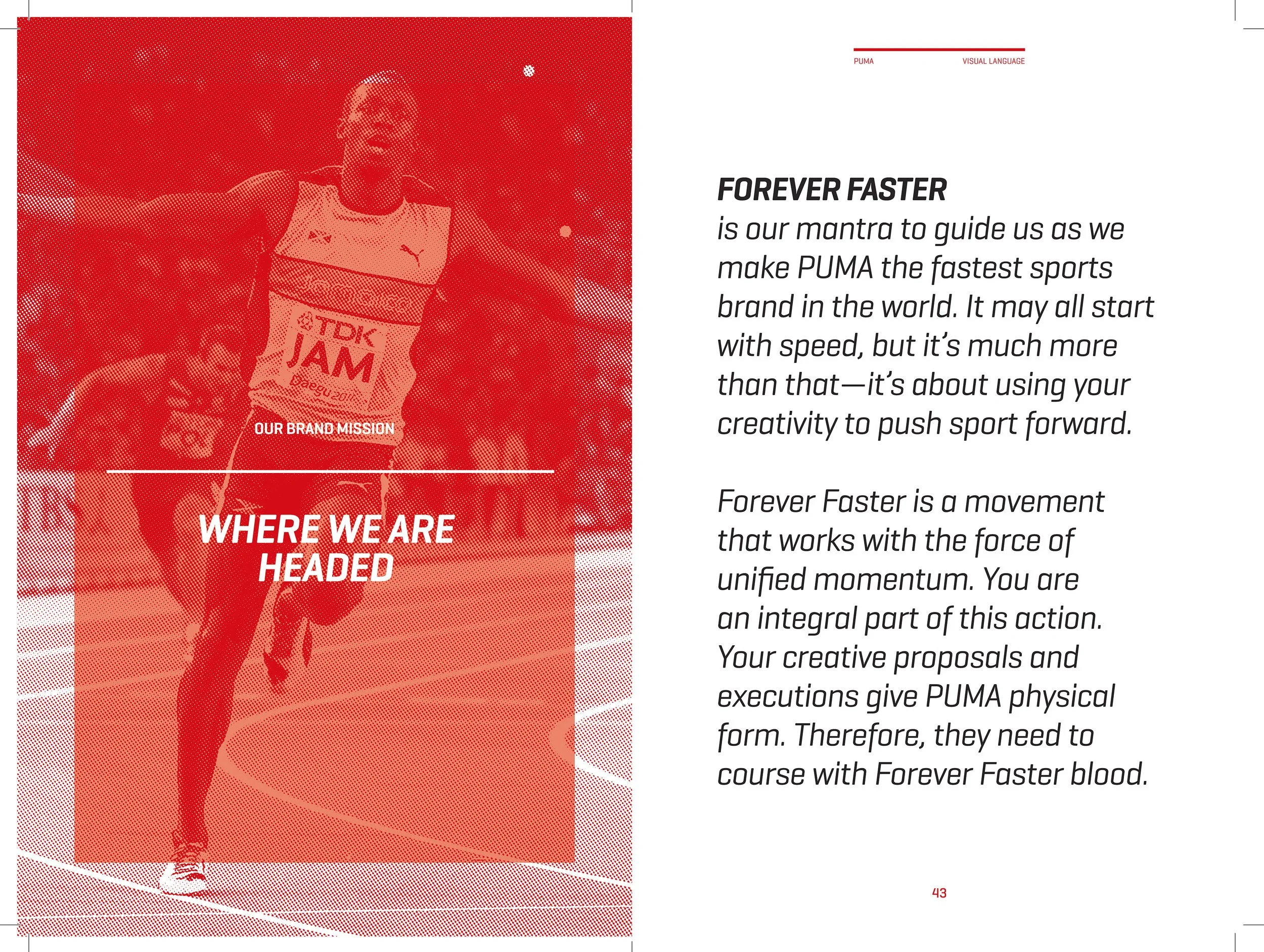
One of the efforts to re-establish the brand had been underway. What I will call the “Forever Faster Movement” initiated by marketing was created as a way to recall the heritage of the brand while at the same time making it a portal for contemporary goods. A new Brand Mission and the Forever Faster tagline was created. It was emotional, relevant and something to which I could stand behind. However when it came to executing against it - realising products, graphics and space that spoke the same words - there was nothing to which the design community could turn; no doctrine to hold true. I knew from working under Peter Moore, one of the best creative directors in the world, that creative guidance required using a certain voice - a narrative that was not only potent verbally but also visually; one that was relevant (if not leading) to the consumer and authentic to the brand. Taking a page from his playbook, I knew Puma needed a Visual Language guide that would do so.


Visual Language should be the voice of a Creative Director. While I was not in that role at the time, I both championed and spearheaded the effort to create one for Puma. I mined (literally) the Puma archive which at the time was amassed on a series of Ikea shelving units in a makeshift top floor space within the old Puma headquarters in “downtown” Herzogenaurach. The shelves were filled with products, prototypes, catalogs, marketing and promotional materials, as well as other one-off items.


-

The collection was the result of the former Puma marketing head turned brand historian Helmut Fisher; the individual responsible for signing magnanimous athletes such as Maradona and a person who can call Yusain Bolt a personal friend. He collected all of these things over the years storing them at his home until he decided it belonged at the company rather than in his attic. I developed an intimate dialogue with him unearthing priceless anecdotes and historical accounts. I went through the entire collection identifying everything that was first pioneering in terms of purpose and function; an outstanding representation of newness that was meaningful, authentic and set the brand apart from any other. It turns out there was quite a bit. Puma was the first brand to put sticky-like materials on the toe of a football shoe placed to making kicking more powerful; a technology that would later go on to define and era of Adidas
-

football shoes. Puma was the first sports brand to introduce shoes that were laceless; using velcro straps instead. Making an innovative statement outfitting the Cameroon National Team, the brand combined shorts and jersey to create a one-piece football kit creating seamless comfort from top to bottom. This reality would later become Puma Innovation’s ‘Culture of First’ ethos. But it was not only the products that embodied a unique presence, the athletes that represented it were one-of-a-kind as well. From Martina Navratilova who alongside her prolific performances moved equality in tennis forward, to Abebe Akila who after rejecting his former sponsors shoes because they were uncomfortable and ran the 1960 Olympic Marathon in Rome barefoot and later won again in Puma shoes, to Boris Becker who was the youngest player to win Wimbledon, Puma athletes helped change the world of sport.
-

Both the products and the athletes that wore them represented the unique DNA that the brand held. All told what I put together was a story of sports technology firsts and history making athletic performances; one of which to be proud and to aspire to continue. I curated and documented the items into a collection of footwear, apparel, accessories, print ads and photography all of which formed a visual narrative that would represent the best of what the brand had to offer in its near 60 year existence. I wrote accompanying text that highlighted the significance of the items romanticising the relationship they had with the athletes that made them meaningful performance and industry statements.
-

Sup-Form-Sohle Poster, 1962
The designer made the clear statement that this Puma track spike had a last that fit “close to the skin” by choosing to superimpose a barefoot print on the last bottom shape was a simple idea that did the job.
-

“Ich Bin Fich Für Puma” Advertisement, 1982
This high-contrast image communicates the visual strength of the brand. The strong stance of the PUMA legs framing the small silhouette of the opposing player denotes boldness, while the phrase “I am for Puma” conveys the power of the team.
-

Leichtathletik Poser, 1962
In this poster, the juxtaposition of the performing athlete as a black and white photograph against a collared duotone background was a direct way to make the athlete stand out. The PUMA wordmark over an icon of the globe makes the statement that the brand is global.

Color!
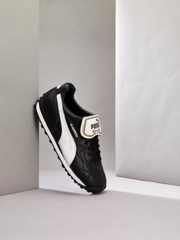
In a field where boots were strictly black and white, PUMA couldn’t resist playing with color. Pelé debuted the first football boot with a gold form-stripe at the 1970 World Cup setting the stage for adistinguishing approach to color on the pitch ever since.
Fashion!
Puma’s pioneering collaboration with fashion designer Jim Sander was the first of its kind. It established the so-called sportstyle what is now a mainstay in the industry.
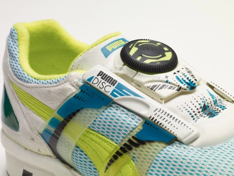
Technology!
After being the fi rst performance wear company to eliminate laces by incorporating hook and loop in the 1960s, PUMA outdid itself by developing the disc lacing system. This technology, which was developed in the early 1990s and is still being used and refi ed today, allows snug, custom fi tting. internal wires are tightened by a simple twist of the disc.

But the exercise was not simply to repackage and retell the past. It also needed to acknowledge present design activity that was relevant to the narrative and could also serve as inspiration to the Puma design community. I reviewed the product collections in development and was able to identify design efforts that represented the same uniqueness of the past using contemporary means.
The working document I created served as comprehensive representation of how the brand was interpreted into both two and three dimension and in a way that was fitting to the brand. But in order to safeguard that future interpretation of the brand would continue in a unified way principles needed to be established. Through a series of collaborative workshops with an external design agency, we crafted five design principles that would account for a majority of the books content. Careful choices in size, paper, print and photography quality were made in order to have the book feel like a creative manual for the brand. Every Puma designer was issued a copy which they could refer to regularly as they did the work of shaping the future of the brand in a way that was true to its personality and character.

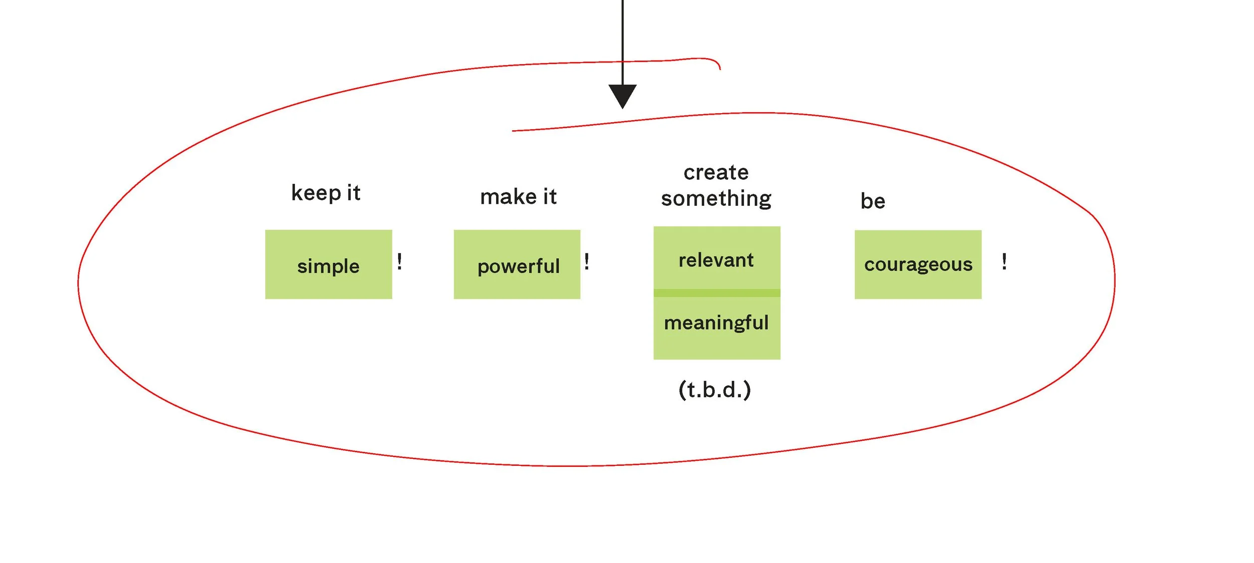

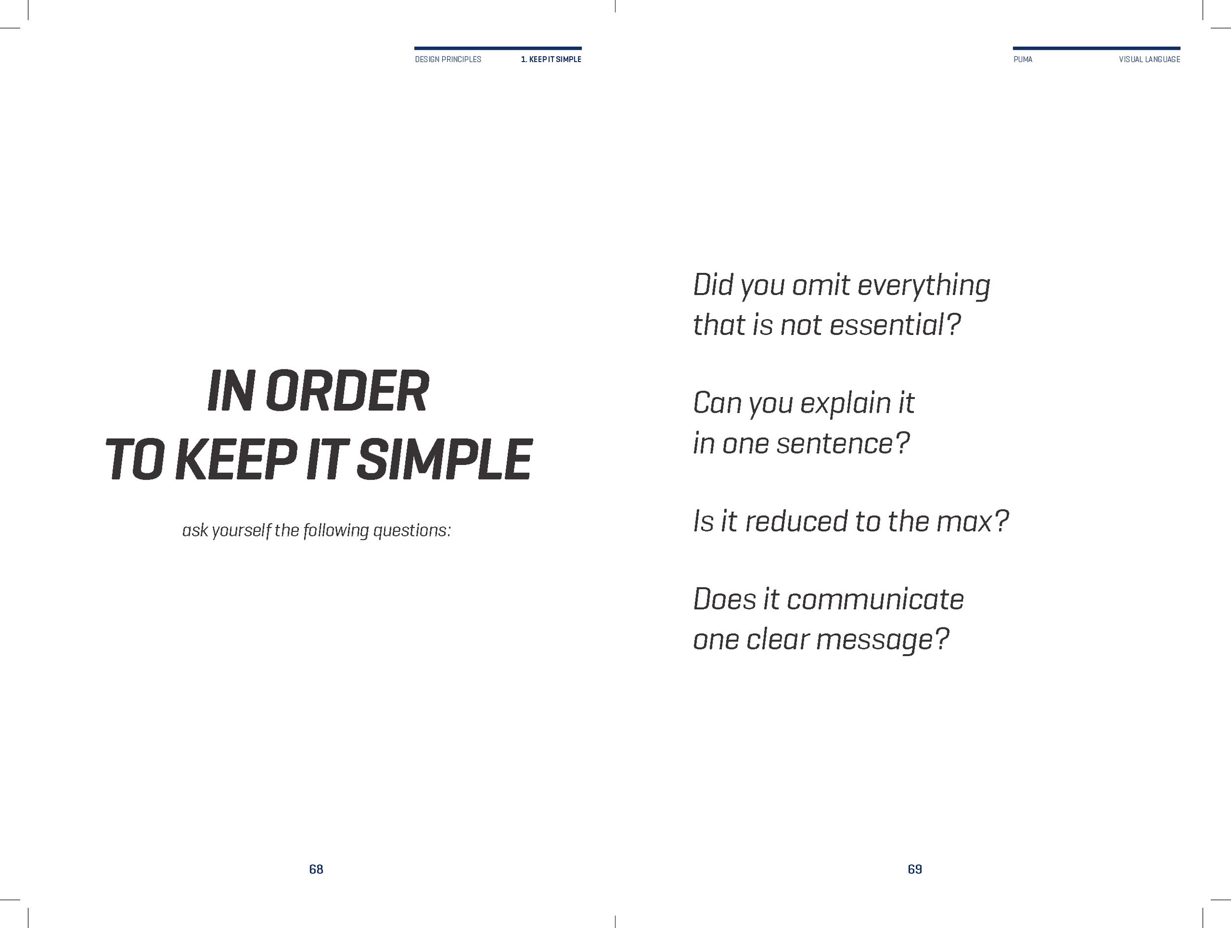
KEEP IT SIMPLE
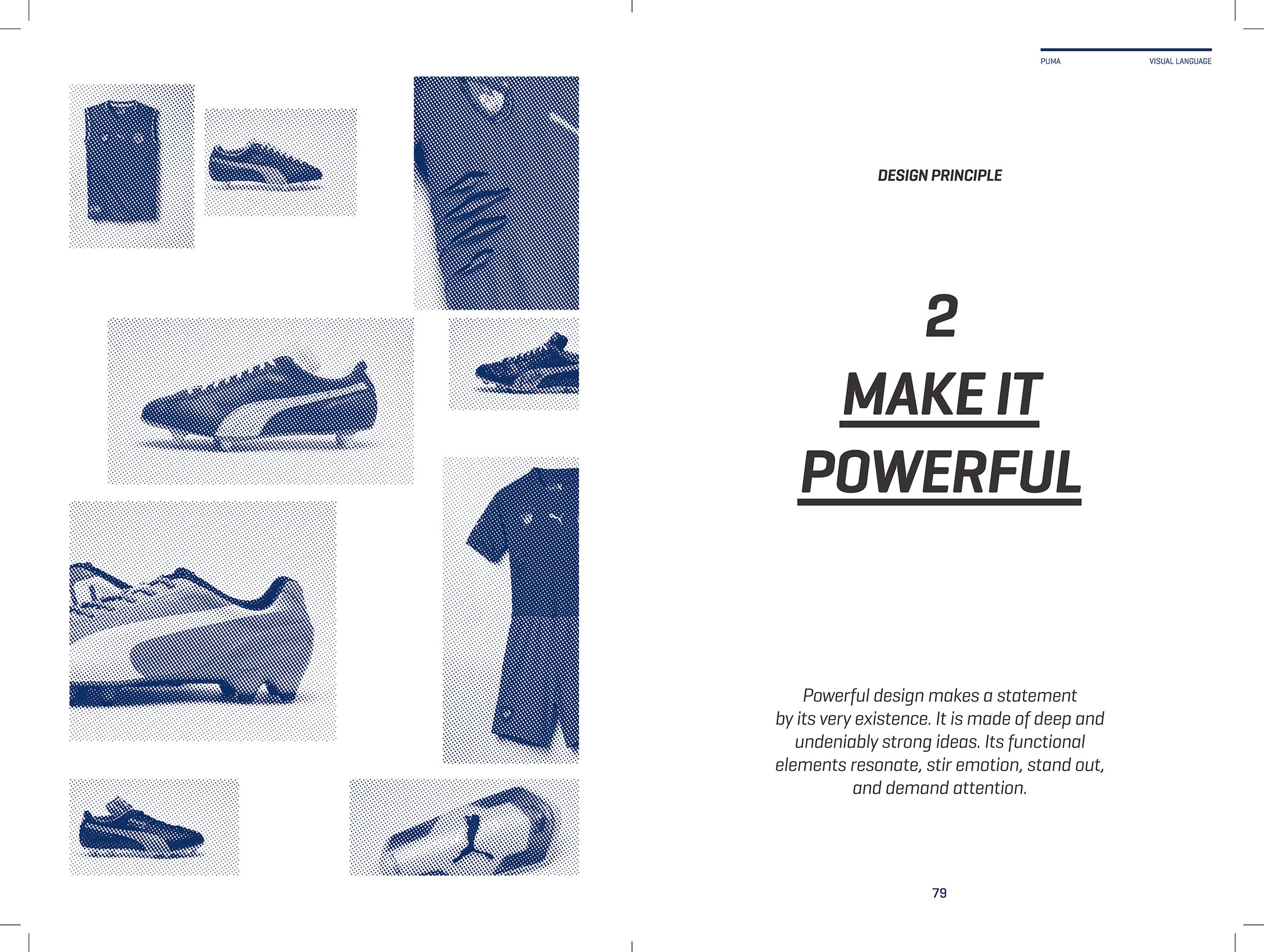
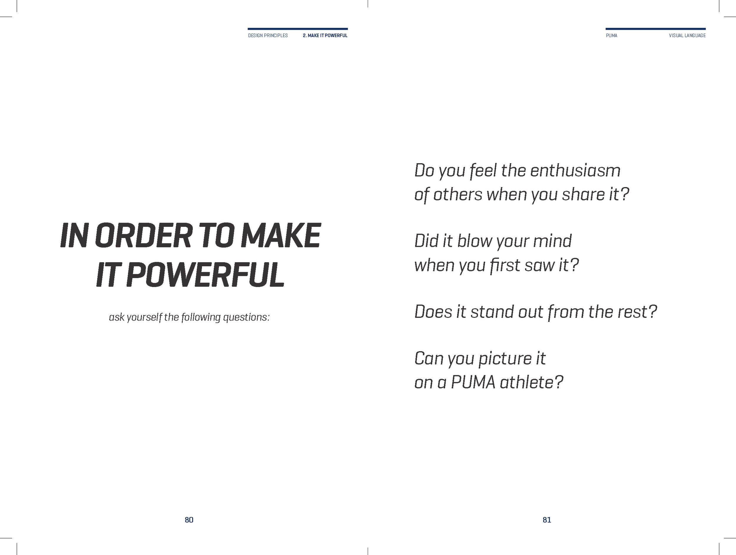
MAKE IT POWERFUL
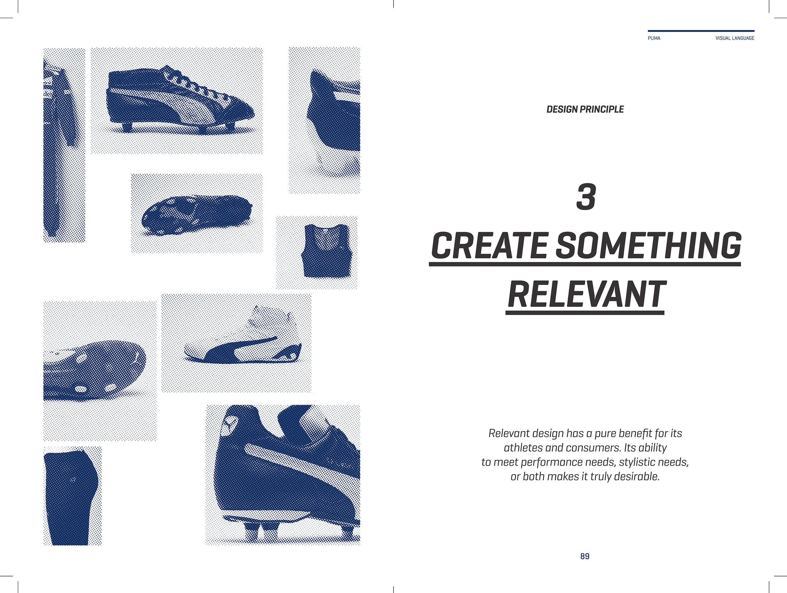
CREATE SOMETHING RELEVANT
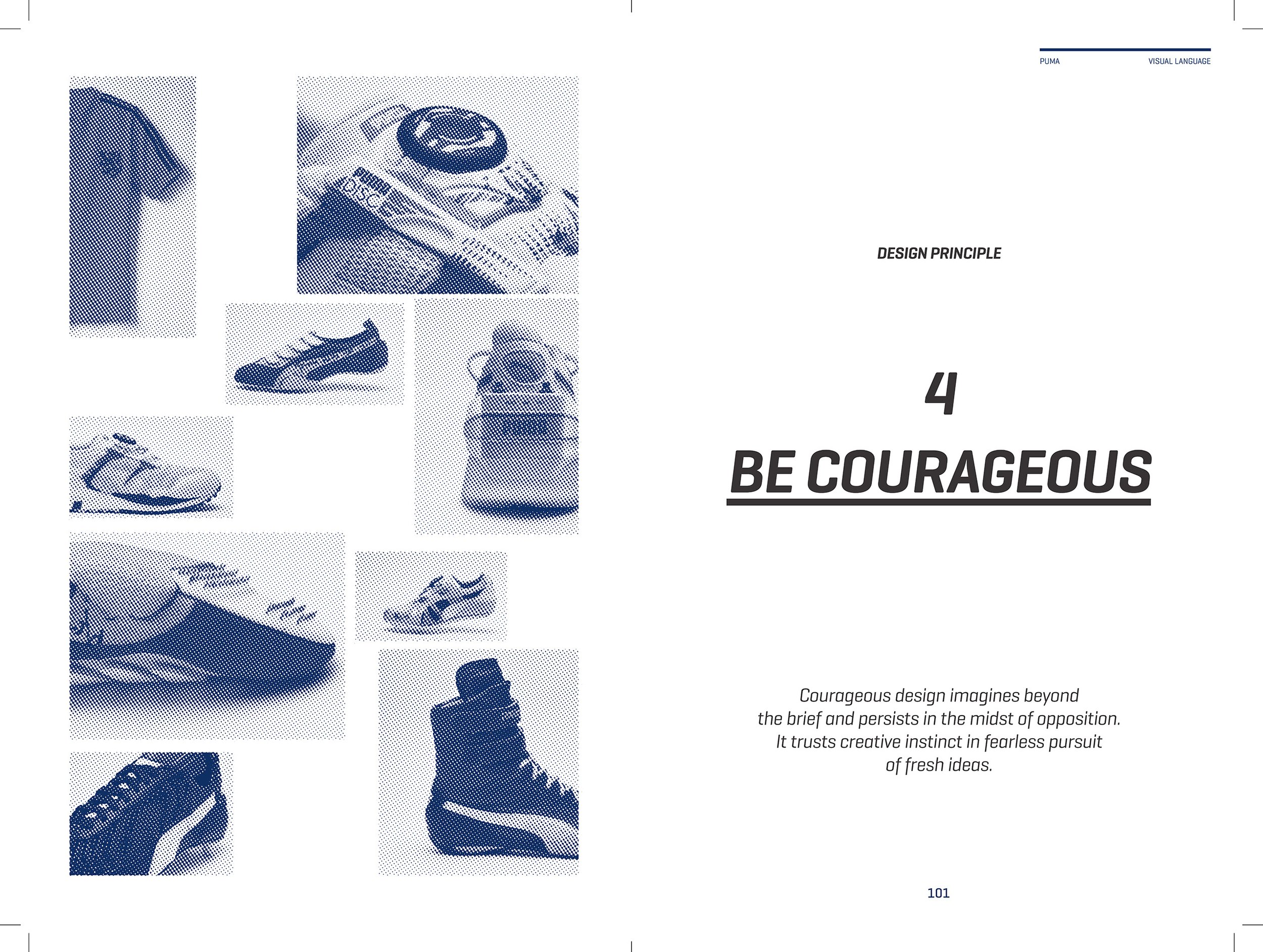
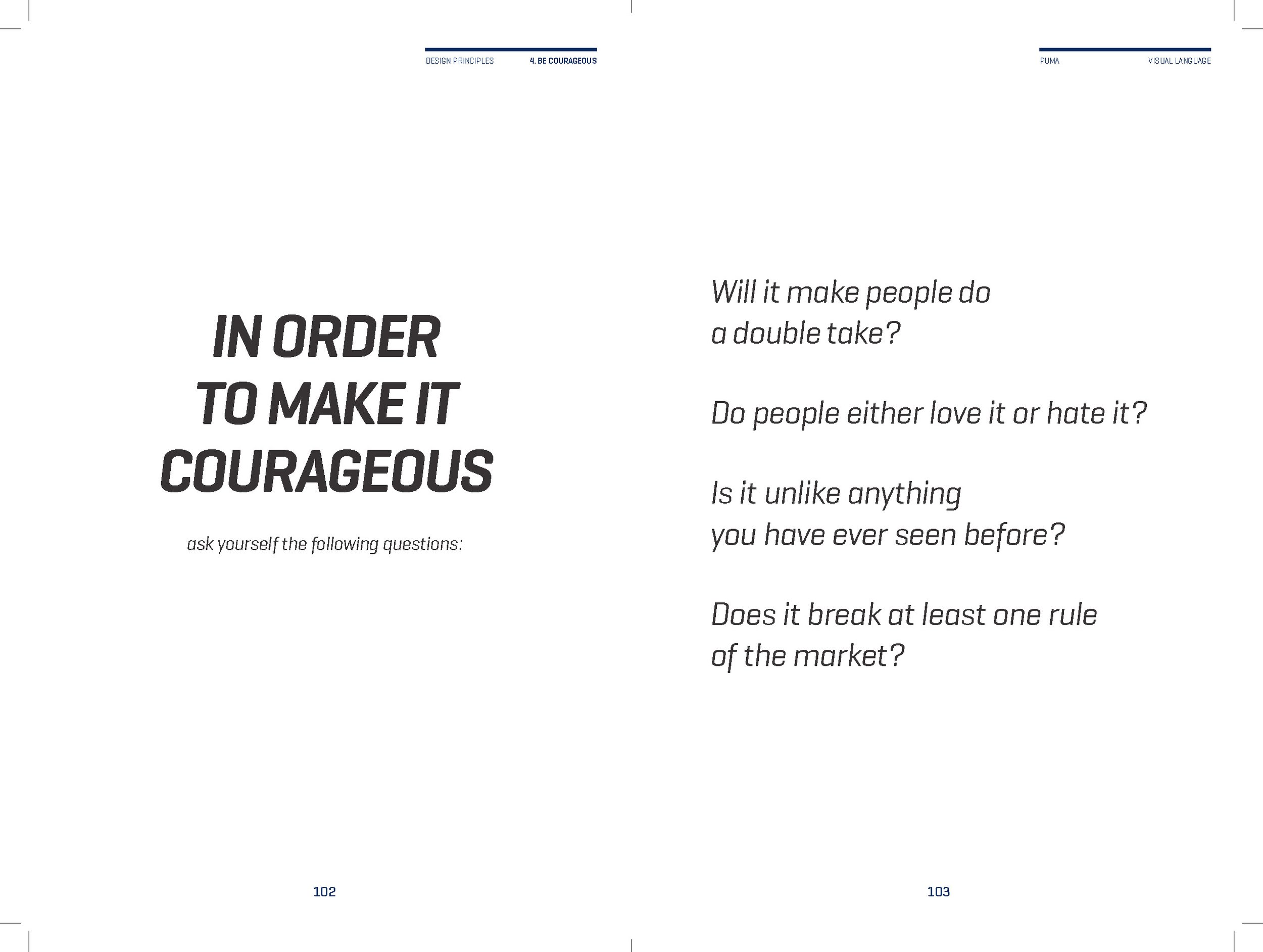
BE COURAGEOUS
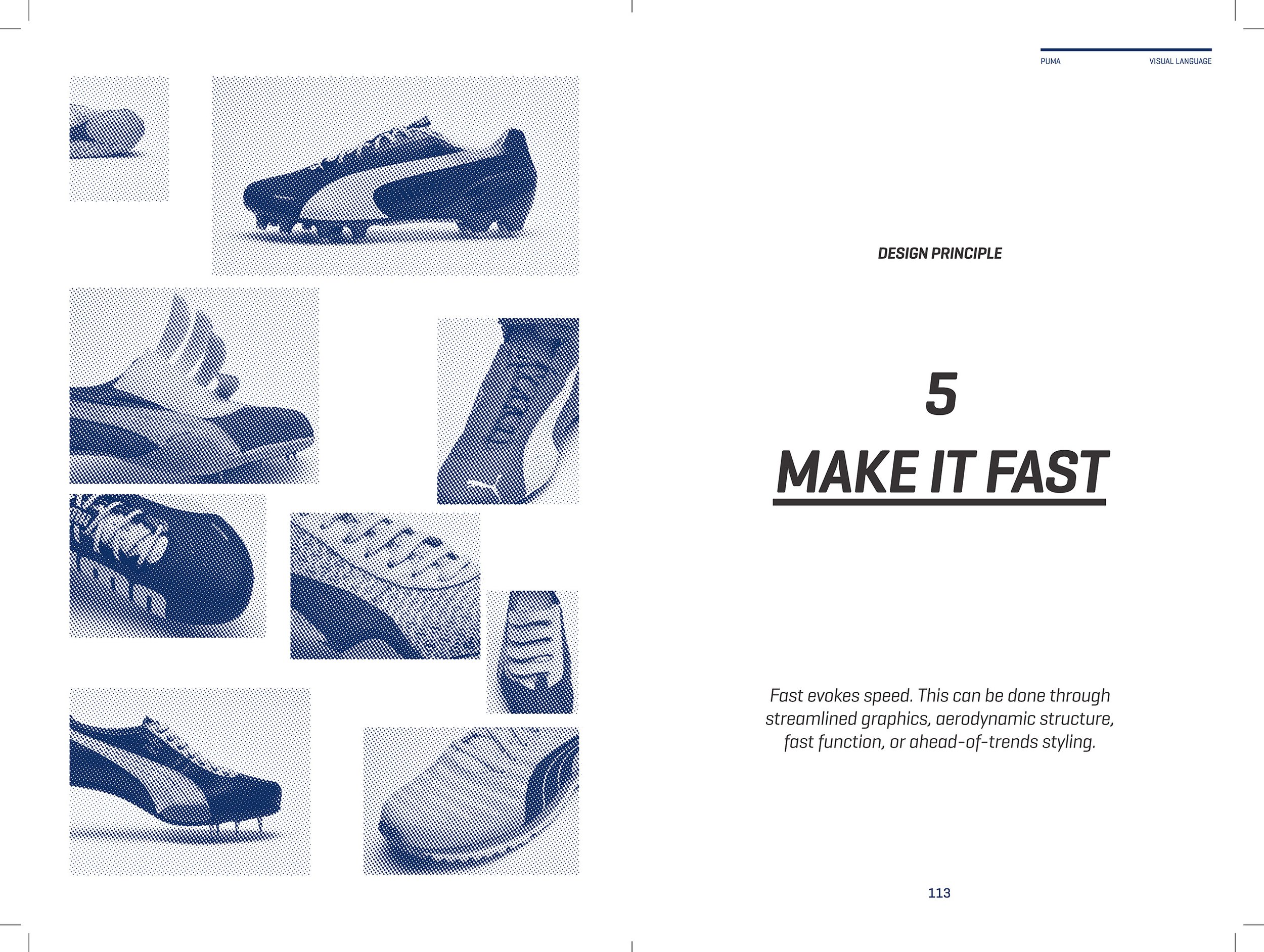
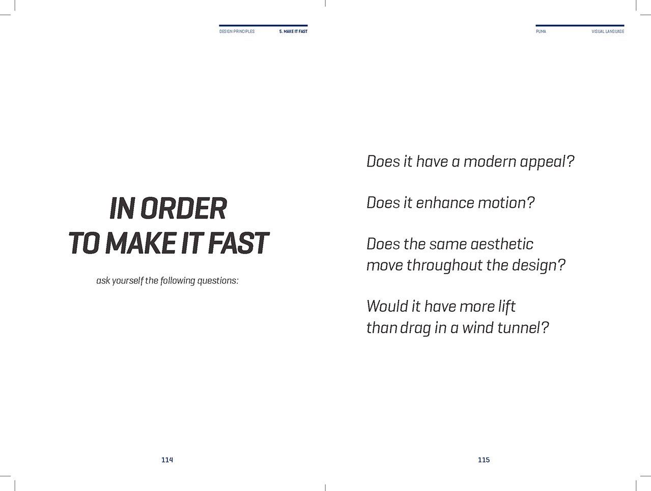
MAKE IT FAST


Project Profile
What is it?
A book designed to provide guardrails to Puma creatives.
Why is it innovative?
For the first time it provides a comprehensive profile of the brand, it’s values, mission and design principles through a carefully curated representation of products and images both old and contemporary.
What were the biggest challenges?
Making selections from the thousands of products and images from the Puma archive. Identifying which were essential to include and which were not.
What was your role?
Brand Liaison, Curator, Writer, Editor
Working with an external partner I was the primary connection point between the agency and the Puma brand. I guided on a deep project level all aspects of the development.
Why was it successful?
It served to bring needed clarity to the Puma creative community.